A dying world.
The ash has not settled.
on fire.
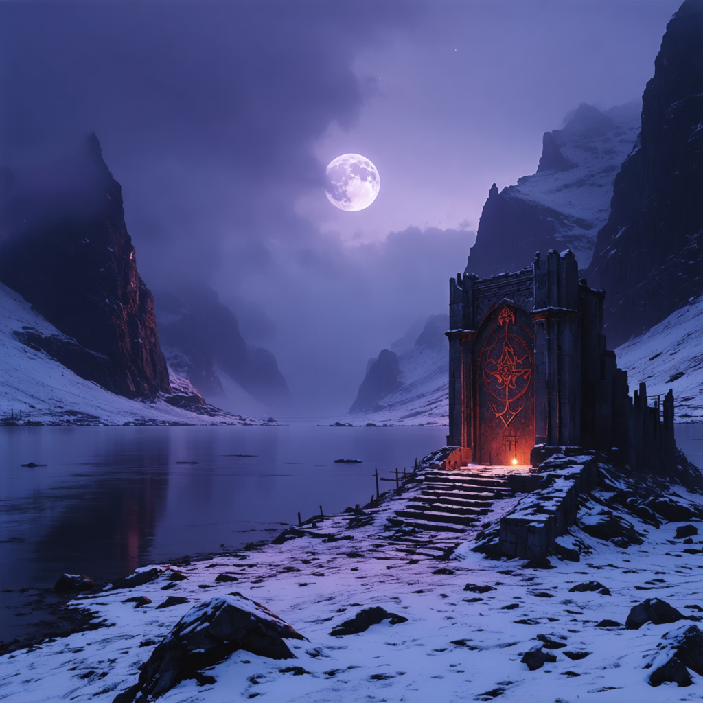
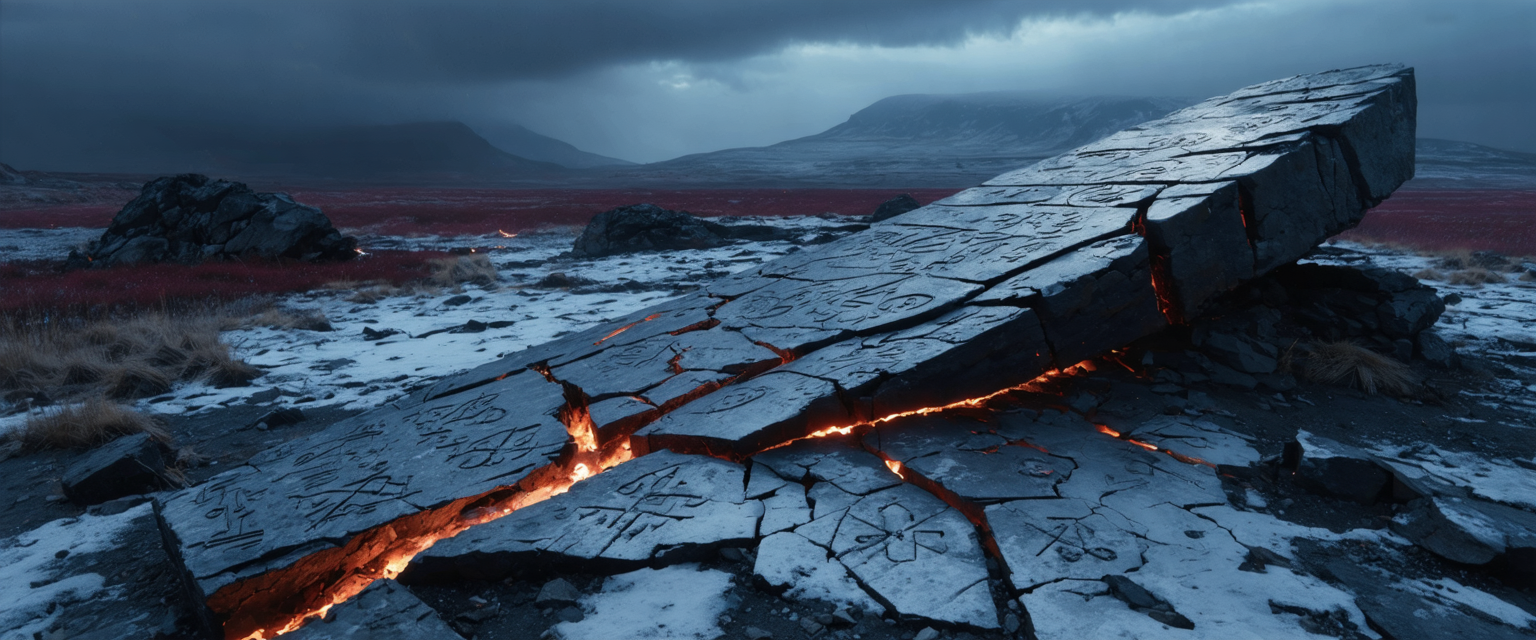
Mainland Europe is being consumed by Ragnarök — not the future Ragnarök of prophecy, but something already happening. A slow, creeping fire from below. The ground cracks. Heat bleeds through stone. The sky is a bruise that never heals.
The Vikings are not here to witness the apocalypse. They are here to raid it.
The corruption is the world's new baseline. There is no clean land beneath it. The land is dead and cold on the surface, but something underneath is burning. Cracks in stone glow deep red. Snow carries a faint rust stain. Nothing warm survives here except the heat from below — and that heat is wrong.
Rune-driven.
Not stopping.
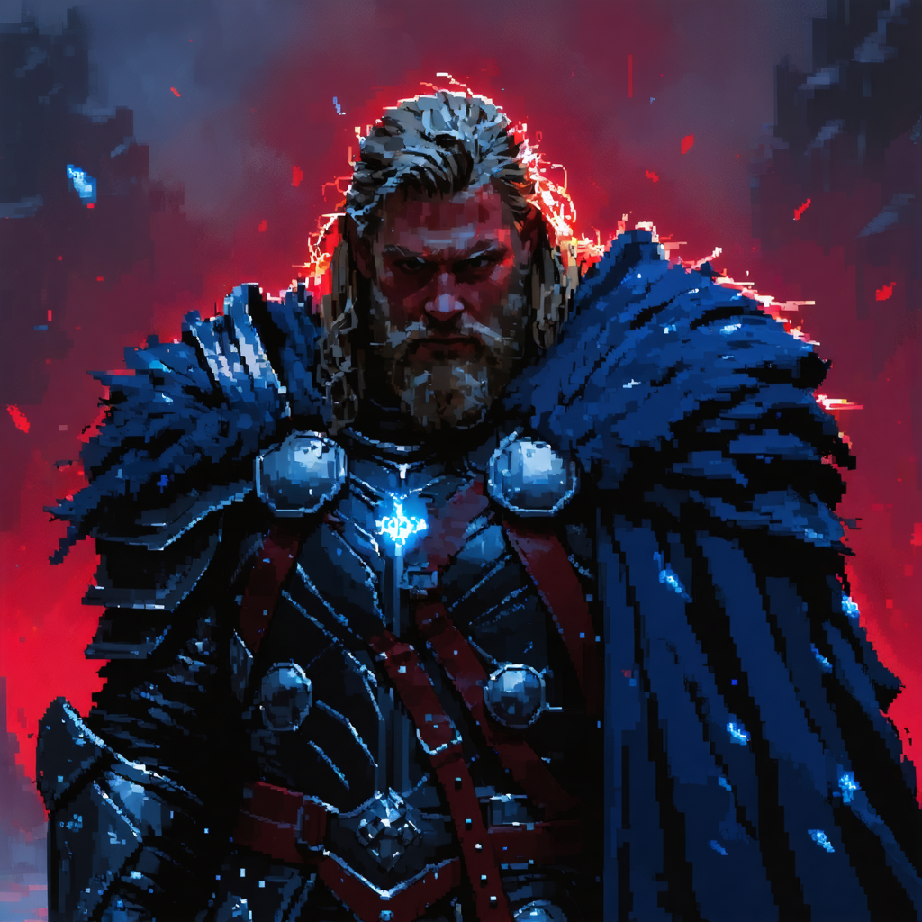
Two playable personas — Thor and Valkyrie archetypes. They are not heroic in posture. They are spent. Worn armour, dark circles, the stare of people who have been moving for too long.
What keeps them going is not willpower. It is the runic power bound into their bodies. The runes are the only warm thing about them.
not a final constraint.
The palette below is a directional proposal — not a locked spec. The world should feel cold, dead, and desaturated with heat bleeding through from below. How exactly that translates into pixel art colours is something we want to develop collaboratively with the right artist. If you have strong instincts here, we want to hear them.
Current thinking: two core hues — cold grey-blue for the dead world, deep red for the corruption and runes — plus bruised purple reserved for sky and atmosphere. The spread may need a warm neutral (bone, aged leather) to give character materials a distinct read from stone. That's an open question.
Note: the three reds are one hue at three brightness values, and the greys are similarly close. Whether this is the right spread — and whether a warm neutral is missing — is part of the conversation we want to have.
Encounters are played on a semi-isometric hex grid. Characters are 2D portrait sprites placed on the field — always facing one of six compass directions.
| Asset | Dimensions |
|---|---|
| Viewport | 320 × 192 px — scaled 4× to 1280 × 768 on screen. |
| Hex grid | 12 × 12 tiles. ~13.5 tiles wide due to hex offset — design backgrounds to 14 wide to be safe. |
| Tiles | 32 × 16 px isometric hex. Environmental objects (trees, cliffs, edge pieces) are separate assets on impassable tiles — single or multi-tile. |
| Backgrounds | 320 × 192 px painted behind the tile grid. Freehand or tile-based. |
| Characters | 32 × 48 px in a 64 × 64 frame. Frame provides animation headroom. |
| Enemies | 32 × 32 px. Elites: 32 × 48 px. Can be smaller than spec. Bosses: bespoke, can span multiple tiles. |
| Facing dirs | 6 total: N, NE, SE, S unique. NW mirrored from NE; SW mirrored from SE. |
| UI & Cards | 1280 × 768 px native. Own visual layer — pixel art aesthetic at legible text fidelity. |
| Full-screen art | 1280 × 768 px. Loading screens, splash, title. No pixel grid constraint — painterly work viable. |
Concept art shown is photorealistic mood reference. The pixel art interpretation is part of what we're commissioning.
Sprite frame reference — character occupies 32×48 within the 64×64 animation frame.
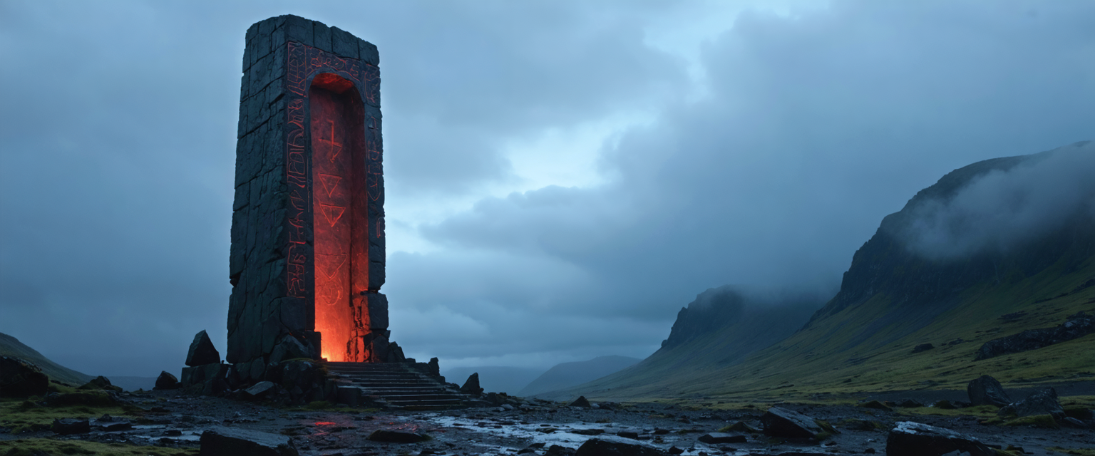
Environment mood reference — standing monolith.
The closest single reference is Sword & Sworcery — sparse pixels, restraint, darkness that implies more than it shows. If you've studied that game, or come from a similar tradition of deliberate limited-palette pixel art, you'll understand this direction immediately.
This is not high-detail painterly pixel art. It's atmosphere through constraint. The world is depleted — colour is a resource that's been burned away.